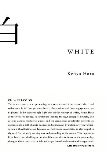
Cover of White

White

Kenya Hara

11 ideas

  1. White as Absence, Not Color

    White is best understood not as one color among many but as the absence and emergence point from which all colors arise. By treating white as a condition of emptiness rather than a hue, it becomes a sensory threshold where meaning has not yet been imposed.

  2. Texture and Material as Information

    The whiteness of paper, fabric, or porcelain is perceived through its tactile and material qualities, not just its visual hue — the grain, weight, and surface carry meaning the eye registers as feeling. Treating materials as carriers of information shifts attention from what something says to how it physically communicates to the senses.

  3. Cleanliness Signals Renewal and Intention

    White surfaces show every mark, so maintaining whiteness requires constant care, which transforms cleanliness into an active cultural value rather than a passive state. The fragility of white communicates that something has been deliberately kept pure and freshly prepared for use.

  4. Designing by Subtraction

    Rather than adding features to create value, one can refine an object or message by stripping away until only the essential remains, increasing clarity and resonance. Emptiness achieved through subtraction creates a quiet space that lets the intended function or feeling stand out.

  5. Ma — The Generative Power of Gap

    The interval or pause between elements is not wasted space but an active component that gives surrounding elements their rhythm and meaning. By consciously shaping the gaps — in layout, timing, or sound — one controls how attention and significance distribute across a whole.

  6. Blank paper as a demand for resolve

    A white sheet makes any mark permanent and visible, so its blankness puts pressure on the person about to write. This tension forces deliberation and commitment, as in the Chinese poet Jia Dao agonizing over whether a monk should "push" or "knock" on a moonlit gate. Seen this way, whiteness is an ethical pressure toward finished, carefully chosen expression, not a neutral background.

  7. Emptiness differs fundamentally from Western simplicity

    Western modernist simplicity reaches minimal form by rationally stripping away excess to serve function. Japanese emptiness is a deliberate withholding that opens space for the viewer's imagination. One reduces toward an optimal answer; the other refuses to answer so that many answers can arise.

  8. Horizon campaign: branding through empty landscapes

    The images made no product claims. They worked as empty vessels, letting viewers project their own values onto the brand instead of receiving a slogan.

  9. White as a sensibility, not a color

    White is better understood as a way of perceiving than as a hue. It evokes the untouched state before something begins, and the cycle of renewal, as in the Ise Shrine, which is rebuilt anew every twenty years. Designers can use white to signal freshness, potential, and a return to origin rather than mere absence.

  10. Emptiness as a receptacle for meaning

    An empty vessel's value lies in the potential of what it might hold, not in being unfilled. Communication built on emptiness does not transmit a message; it offers a receptive space that each viewer fills with their own images and thoughts. Meaning is therefore co-created by the recipient rather than delivered by the sender.

  11. "This will do" over "this is best"

    Products can aim for "this is best," which carries insistent preference and ego, or for "this will do," which carries a reasoned, satisfied acceptance. Designing for "this will do" means creating goods that step back and accommodate the user's life. The goal is to raise the quality of "this will do" until it becomes a confident, dignified choice rather than a compromise.

Save and mark ideas in the app