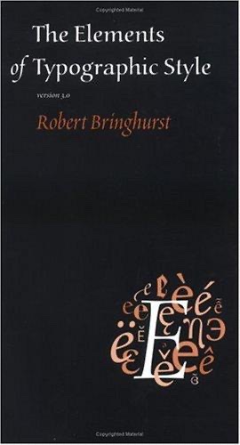
Cover of The Elements of Typographic Style

The Elements of Typographic Style

Robert Bringhurst

3 ideas

  1. Typography exists to honor the content

    Bringhurst argues that typography's first duty is to serve the text rather than to display the typographer's cleverness. Its job is to invite reading, reveal the text's meaning and structure, clarify relationships between its parts, and give the reader's eye rest during long reading. When the letterforms call attention to themselves at the text's expense, the typography has failed, however striking it looks.

  2. Page proportions derived from musical intervals

    Page shapes and text-block dimensions should come from proportions with inherent tension and harmony, not from arbitrary sizes. These include ratios matching musical intervals (2:3 fifth, 3:4 fourth), the golden section, and ratios generated by regular polygons. The margins and text area are then set in relation to the page, often so that the text block echoes the page's own proportion, producing a structure the eye reads as organic and resolved.

  3. Measure of 45 to 75 characters

    The line length, or measure, most comfortable for continuous single-column reading is about 45 to 75 characters including spaces, with 66 treated as ideal. Lines that are too short break up phrases and cause excessive hyphenation. Lines that are too long make the eye lose its place when returning to the next line. Leading must grow as the measure lengthens, so that the return sweep of the eye stays reliable.

Save and mark ideas in the app