Build better, not bigger
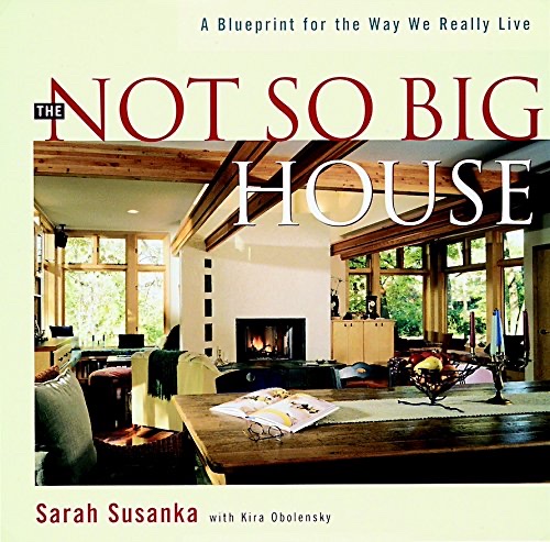
Susanka argues that American homes waste money on unused square footage while lacking the details and proportions that make a space feel like home. Spending on quality and tailoring beats spending on size.
6 ideas
Susanka argues that American homes waste money on unused square footage while lacking the details and proportions that make a space feel like home. Spending on quality and tailoring beats spending on size.
She criticizes the formal living room and other 'company' spaces that sit empty, arguing every room should earn its place in daily life. A smaller house of used rooms lives larger than a big house of dead ones.
Susanka names concrete techniques, ceiling-height variation, framed views, light from two sides, and interior thresholds, that make modest spaces feel rich. Comfort comes from designed detail, not floor area.
She frames good residential design as fitting the specific rhythms and rituals of the people who live there. A home succeeds by being tailored, not by conforming to a generic ideal of impressiveness.
Susanka favors defined, sheltered zones for specific activities over vast open volumes, giving inhabitants a sense of enclosure and belonging. Nooks and alcoves outperform undifferentiated great rooms.
Reallocating a building budget from more space to better space yields a home that is more livable and often no more expensive. The economic argument reframes luxury as care rather than quantity.