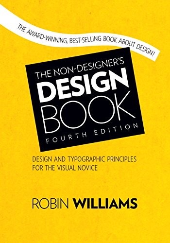
Cover of The Non-Designer's Design Book

The Non-Designer's Design Book

Robin Williams

3 ideas

  1. The Four Principles: Proximity, Alignment, Repetition, Contrast

    Effective visual design reduces to four mechanisms: group related items together (proximity), give every element a deliberate connection to another element on the page (alignment), repeat visual elements throughout to create cohesion (repetition), and make different elements distinctly different rather than slightly different (contrast). These principles are interdependent and almost always applied together rather than in isolation.

  2. Avoid placing elements in the center by default

    Centered alignment produces a weak, amateurish look because its soft, ragged edges create no strong invisible line to bind the page together. Choosing a strong flush-left or flush-right edge instead creates a defined line that visually connects separated elements and signals intentionality.

  3. Contrast must be strong, never timid

    When making two elements different, they must be made dramatically different — a 12pt versus 14pt font reads as a mistake, while 12pt versus 30pt reads as a choice. Weak contrast looks like an accident, so the rule is to commit fully: if two things are not the same, make them very different.

Save and mark ideas in the app